3. Wales Population Cartogram
Most people in Wales live in Cardiff and the South Wales Valleys, which were industrialised in the 18th century. The west and middle of the country is very sparsely populated.
This visualization shows the relative size of local authority populations in Wales by distorting the map so that each authority has an area that reflects the size of its population.
Notice how Powys in mid Wales shrinks dramatically, while Cardiff (dark green) and the surrounding authorities increase massively in size. It looks like a broccoli floret.
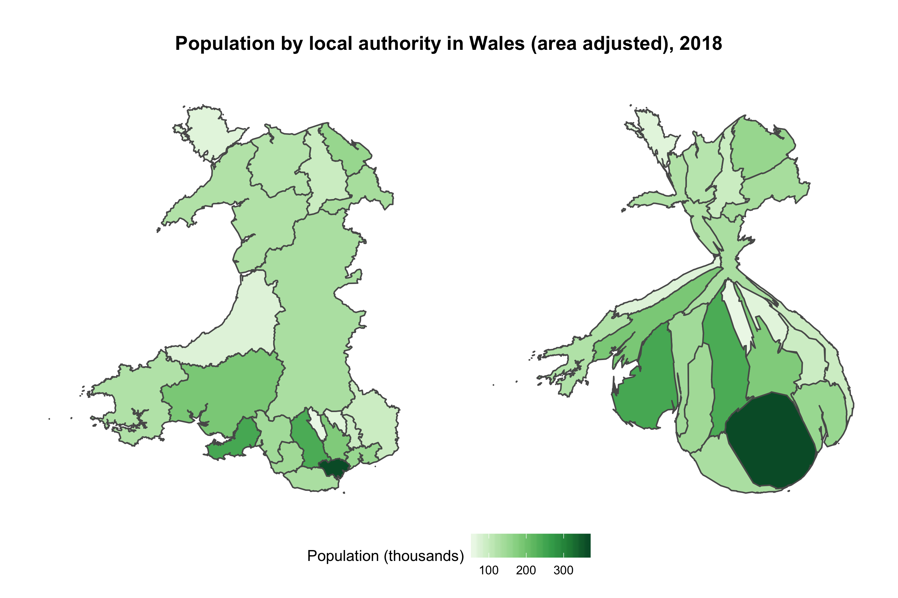
I also created a interactive version (using plotly) which shows the local authority names and population numbers in tooltips, and an animation that transitions between the two maps. The animation was a bit disappointing since it isn’t very smooth (lots of gaps appear for some reason).
Visualization type: cartogram
Data sources:
- StatsWales, CSV, 8 KB
- Lle Geo-Portal, Shapefile, 4.2 MB
Technical notes: generated using ggplot2 and the cartogram package; code
See also: Cartogram example in the R Graph Gallery