8. A decade of GitHub
I have been using GitHub since mid 2009 - over a decade. (For non-programmers: GitHub is a website for hosting code, and for collaborating with other people on open-source projects.)
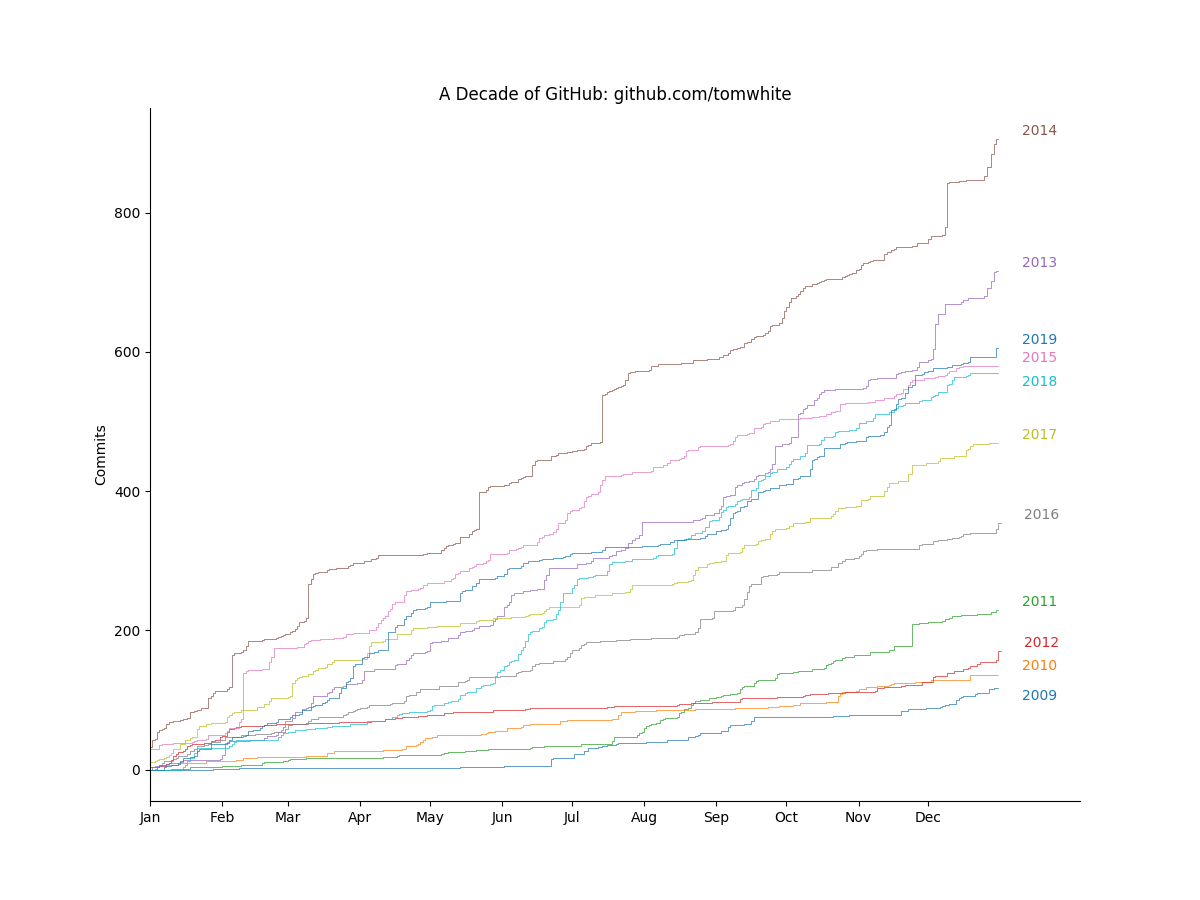
The visualization shows the cumulative number of commits (changes) made by me on all projects over the course of each year. For the first few years, 2009 to 2012, my usage was fairly modest, then in 2013 I started working on a new project (CDK, later called Kite) that used GitHub as its primary code repository. (Until then I had been working on Apache projects, which were not hosted on GitHub, so they don’t show up in this chart.) Development was rapid and it shows in the chart; I finally moved on from the project in 2015. Since then, my contributions have picked up again, with each year from 2017 onwards having more commits than the last.
Another noticable feature is the general lack of activity in August (due to summer holidays), and a small uptick at the very end of the year, which is due to a small side projects I tend to do during the winter break.
I originally intended to make the chart interactive, so that you could hover over any point on a line to see the project that I was working on at the time. However, it turns out that it is difficult to extract all GitHub commits for a user in bulk (as opposed to simply the number of commits made on each day). (However, this project, github-contribs, looks promising.)
The GitHub page for a user has a heatmap for every day that offers something nearly equivalent: if you click on the day you can see the commits (and therefore the projects) for that day. (You can see mine here.) So the two visualizations are complementary.
Visualization type: step chart
Data source: GitHub Contributions API project, JSON, 275 KB
Technical notes: generated using matplotlib, and adjustText to ensure the year labels didn’t overlap; code
See also: My GitHub heatmap