9. iNaturalist observations
iNaturalist is a citizen science project where users share their observations of animals and plants from across the world. At the time of writing there were over 30 million observations on their website, of which almost 13 million were research grade and published under a Creative Commons license.
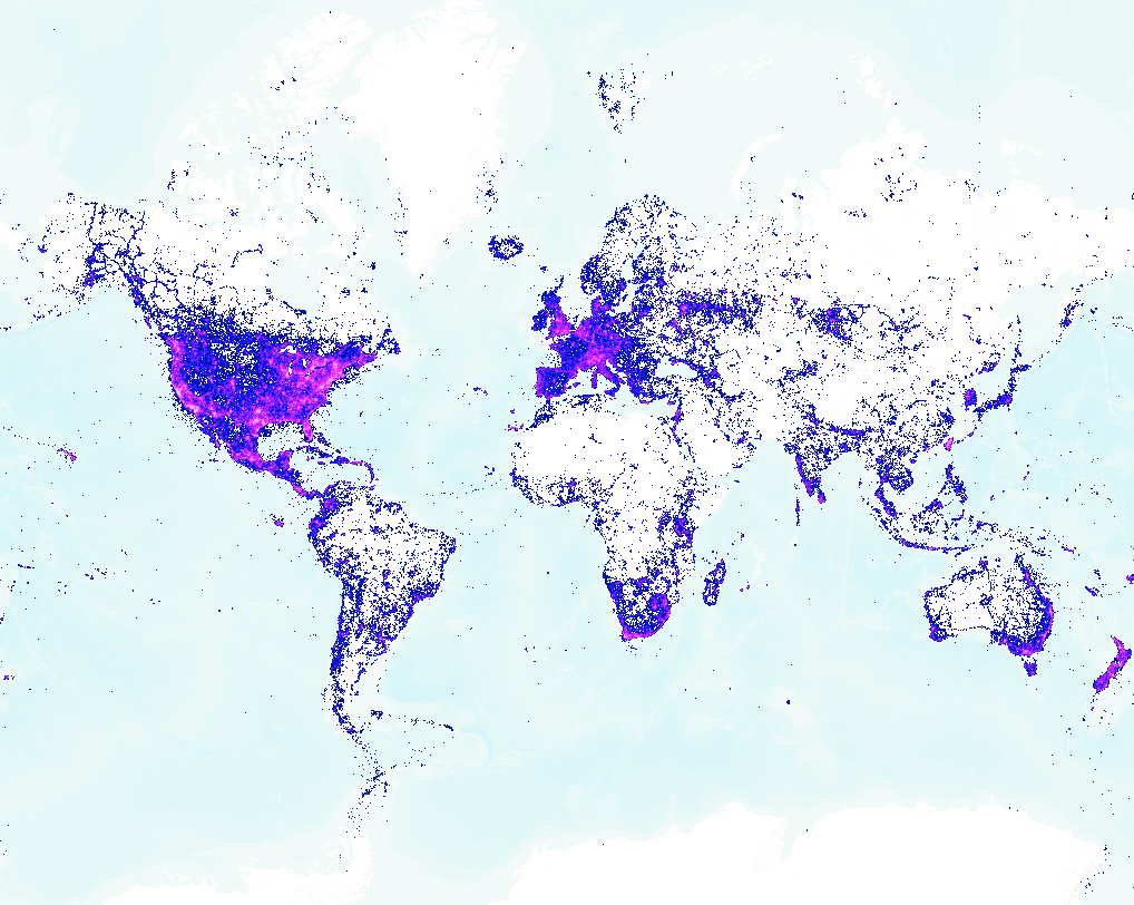
Naïvely plotting such a large number of data points on a map is generally disappointing due to overplotting, since the majority of points overlap, except at very high zoom levels. This is why the iNaturalist observations map shows observations as a heatmap, where darker squares indicate higher numbers of observations. Only when you zoom in far enough do you see individual observations, which you can click on to find out more information about them.
Datashader is an open-source Python visualization library that tackles the problem of overplotting by intelligently colouring each pixel in the image according to the number of points that fall in it. It works for very large datasets: for example, it can plot a billion points in a second or so on a 16GB laptop. This makes it powerful enough to interactively explore a large dataset by panning and zooming around a map.
Most Datashader examples require you to run a program locally to get the interactive experience, but it is also possible to generate all the map tiles needed in advance so that anyone with a web browser can explore the dataset. This is what I did here with the iNaturalist data.
[Click on the map for an interactive version.]
This static image shows the distribution of observations across the world. The blue and pink dots show areas where observations have been recorded. The number of observations ranges from low (light blue) to medium (darker blue) to high (pink).
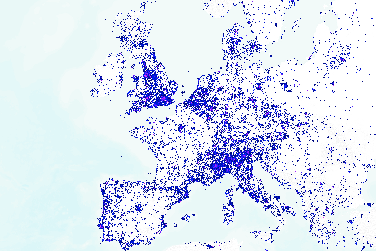
A couple of things immediately stand out. First, observations generally correlate strongly with population centres. This isn’t surprising, since observations are made by people, so they will correspond to where people tend to be located. Second, there are more observations along coastlines, probably because that’s where many people go to see wildlife.
Another interesting detail is the small rectangular clusters (for example, in Poland in the northest corner of the map). At first, I thought this was a bug in my code, but it turned out to be more interesting than that. Each rectangle is a geoprivacy cell, where locations have been obscured by iNaturalist so they are spread out randomly across a given rectangular area. This is done for organisms that have at risk conservation status, to protect them from harm.
Have a play with the interactive map. You can switch background tiles (between terrain, street maps, and satellite maps), and you can adjust the darkness of the background which helps see the contrast with the data points.
This visualization is good for seeing larger scale patterns. For getting the details for a particular observation then use the (zoomed-in) iNaturalist observations map.
Visualization type: zoomable map
Data source: iNaturalist, gzipped CSV, 1.8 GB
Technical notes: map tiles were generated using Datashader (plus this fix I wrote), and the interactive map was built with Leaflet; code
See also: iNaturalist observations heatmap