12. Programming language popularity
Tracking the top programming languages is a favourite sport of programmers. What makes it fun is that there are many ways of measuring popularity, which gives rise to many diferent rankings. Well known ones include the TIOBE index, The RedMonk Programming Language Rankings, and The State of the Octoverse from GitHub.
None of these rankings make their data available, which is a shame. However, GitHut - which uses the GitHub Archive dataset - does. So I used their data to draw a bump chart of the top-ten languages since 2012.
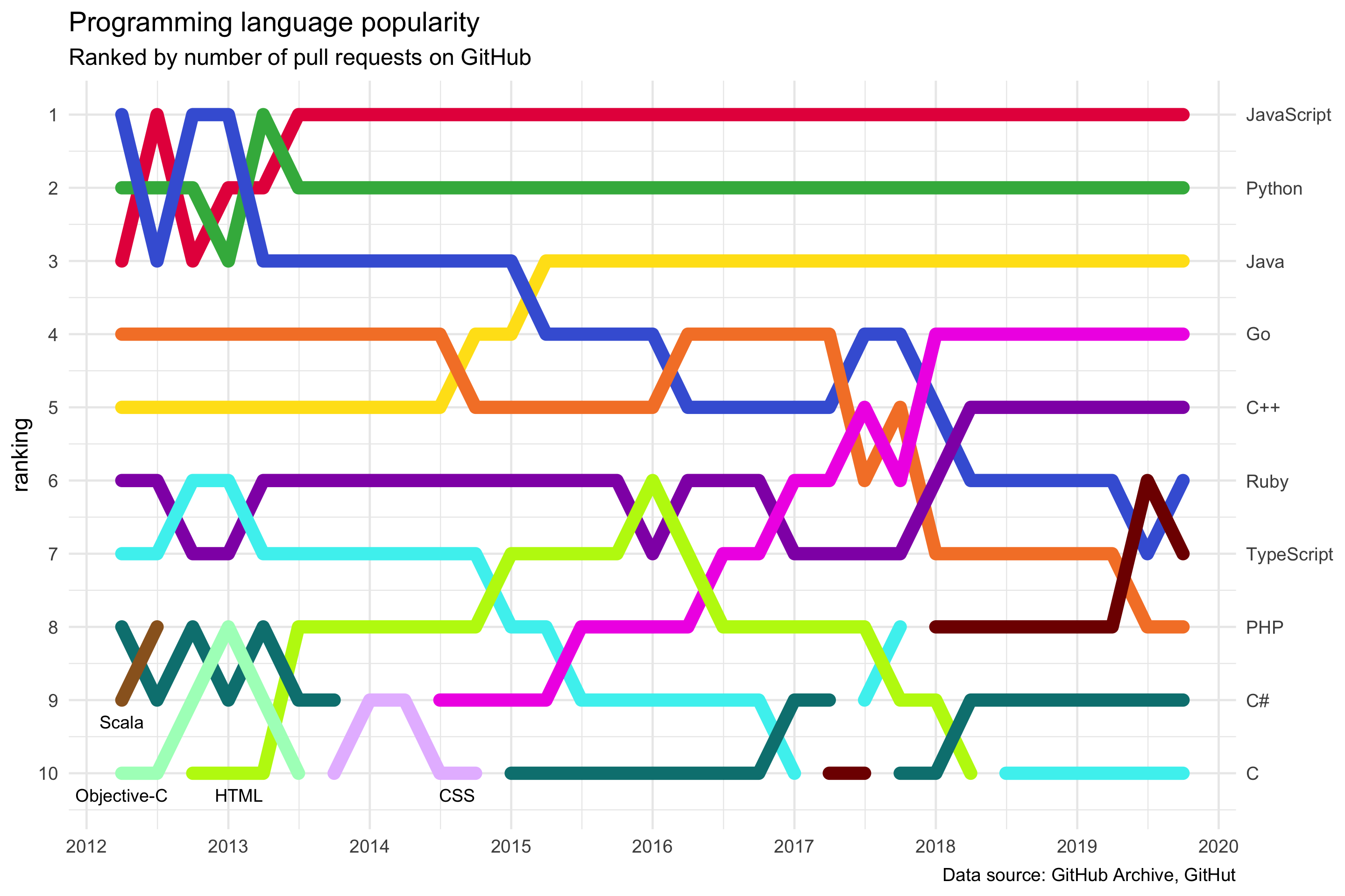
I chose pull requests as the popularity measure, since a pull request is a programmer’s unit of work.
Unsurprisingly, Javascript, Python, and Java are in the top three spots, a story that is repeated in most rankings (except TIOBE, which is often criticised as using a lagging measure). I was surprised to see Go at number four, but the other top-ten languages are the usual suspects.
One challenge in creating this chart, that I hadn’t appreciated before starting, was that some lines are discontinuous since languages can dip in and out of the top ten. C, for example, disappeared in the first quarter of 2017, then returned, and disappeared again, before coming back to the 10th spot for the last 18 months.
Bump charts are a relatively niche visualization, and not many tools support them out of the box (see this excellent visualization of chart types by Andy Kirk). I tried using Flourish’s line race chart (also known as a “horse race”), but I couldn’t make it work since it assumes that the “horses” are the same for the whole race - i.e. they can’t drop in and out. Flourish looks very promising though, and I’d like to use it for other visualizations in the future. But for this week I dropped back to trusty ggplot2.
Visualization type: bump chart
Data source: GitHut, based on data from GitHub Archive, JSON, 214 KB
Technical notes: generated using ggplot2; code
See also: GitHut 2.0, Top 10 Chocolate Bars