26. The Tate collection
I stumbled across a dataset containing metadata for almost 70 thousand pieces of art from the Tate collection from 2014. It includes the title of each piece, the artist, a link to a page with a photograph of the piece, and also the physical dimensions of the piece.
I struggled with how to visualize the dimensions of the art works. Showing all the pieces on one page results in severe overplotting, making it hard to see patterns.
I thought about having a zoom so you could go in close to see the structure, but due to the large number of rectangles to be plotted I found it hard to come up with a useable solution. (Technical note: Using d3’s canvas mode might help here, but I didn’t try it.)
I then hit on the idea of filtering by aspect ratio. This has the pleasing effect of minimizing overplotting since most pieces are distinct sizes, and also of being easy to control by using the position of the mouse to set the aspect ratio.
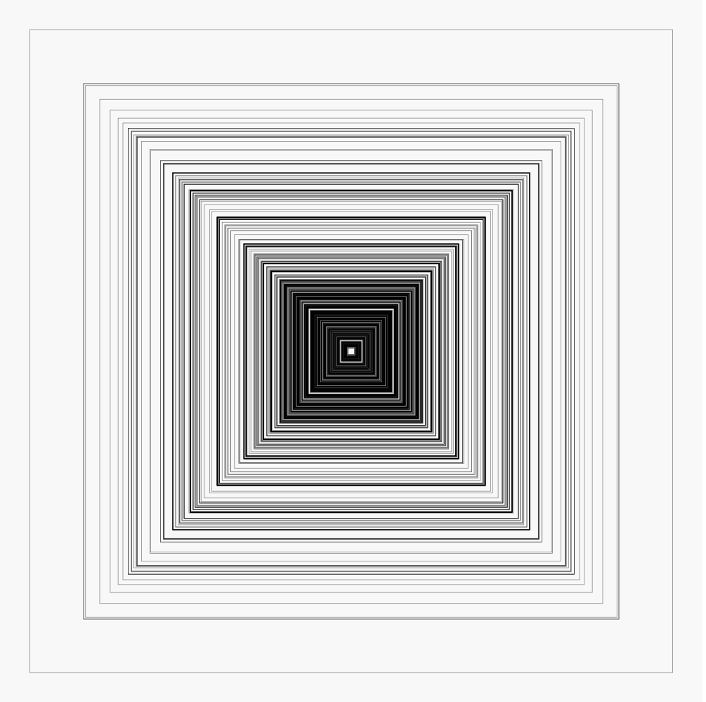
Here are all the square works of art that with sides that are less than four metres in length:
You can view different aspect ratios by trying out the interactive version here. (Be aware that this is quite compute intensive so it is best run on a computer, not a phone. I also found that it seems to work a bit better in Firefox than in Chrome.)
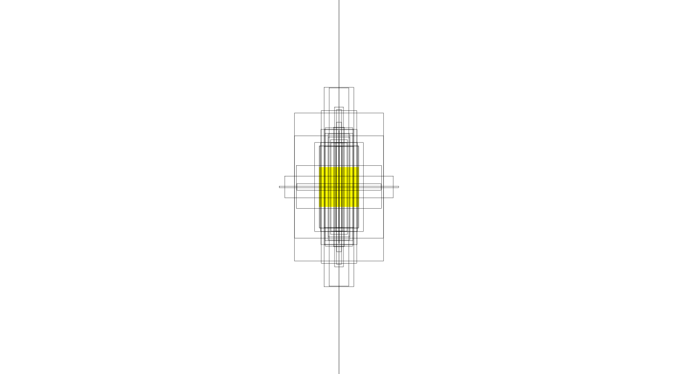
I restricted the view to pieces that are four metres or less in width or height because there are some extreme outliers, including one piece that is over 37 metres in height! This shows all the pieces that have one dimension over eight metres. The yellow square has sides that are four metres long (the same size as the picture above).
Visualization type: rectangles
Data source: The Tate collection via Kaggle, CSV, 26 MB
Technical notes: generated using d3; code
See also: Aspect Ratio of Artworks through Time - a nice exploration of the same dataset by Joseph Lewis. A plot of the size of every painting by Rachael Tatman.