Do Donors Choose Local Schools?
DonorsChoose.org is a site where people donate money to school projects. For example, a teacher in Iowa might create a project request for some beanbags to create a reading area for her pupils. Then, via the website, donors can give as much or as little as they like to the project, and once the target is reached DonorsChoose purchase and deliver the beanbags to the school.
DonorsChoose are running a contest. They have opened up their data, and are challenging developers to "make discoveries and build apps that improve education in America".
I thought I'd do a little hack to answer the question "Do donors tend to choose their local schools?"
I wrote a short Python program to calculate the distance between each donor's address (where it was provided) and the address of the school for the project they were donating to. Then, using R, I plotted the following histogram:
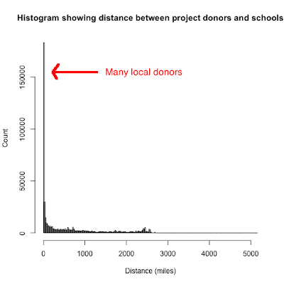
It's striking that many donors are local. In fact, in my analysis, one in four donors live within four miles of the school they are donating to, and the median distance is 128 miles. However, there is a long tail reaching to over 5000 miles!
If we use a logarithmic scale for the y-axis (count), then a couple of features jump out. This plot is a scatter plot where counts are bucketed by integer distance.
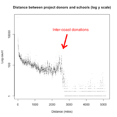
There is a small peak at around 2500 miles, which is puzzling until you realize that this is the approximate distance between the East Coast and West Coast of the USA, where the majority of the population is located. I'm guessing that this bump corresponds to people who donate to schools of friends and relatives on the other coast.
The other noticeable feature is the significant drop off after 2500 miles. This small number of donations is where the donor or school is located in the non-contiguous states (Alaska and Hawaii), which have only a small fraction of the total population.
In the case of the partial ZIP code matching the school ZIP code, I set the distance to zero, on the assumption that the donor lives close to the school. This assumption will tend to overcount the zero distance case, and undercount small distances.
If the partial ZIP code did not match the school ZIP code, I chose a ZIP code with that prefix at random and calculate the distance between that ZIP code and the school's ZIP code. For this calculation I used Kevin T. Ryan's Python code at ActiveState, which I modified slightly to support partial ZIP codes.
The program buckets integers distances and writes the counts to a file. I then used R to plot the distributions show above.
I've put all my code into a GitHub repository.
This hack just scratches the surface of the dataset, and I look forward to seeing some of the cool things that others do in this contest. The closing date is June 30, 2011.
DonorsChoose are running a contest. They have opened up their data, and are challenging developers to "make discoveries and build apps that improve education in America".
I thought I'd do a little hack to answer the question "Do donors tend to choose their local schools?"
I wrote a short Python program to calculate the distance between each donor's address (where it was provided) and the address of the school for the project they were donating to. Then, using R, I plotted the following histogram:
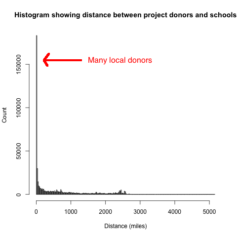
It's striking that many donors are local. In fact, in my analysis, one in four donors live within four miles of the school they are donating to, and the median distance is 128 miles. However, there is a long tail reaching to over 5000 miles!
If we use a logarithmic scale for the y-axis (count), then a couple of features jump out. This plot is a scatter plot where counts are bucketed by integer distance.
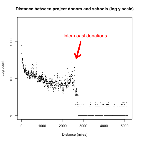
There is a small peak at around 2500 miles, which is puzzling until you realize that this is the approximate distance between the East Coast and West Coast of the USA, where the majority of the population is located. I'm guessing that this bump corresponds to people who donate to schools of friends and relatives on the other coast.
The other noticeable feature is the significant drop off after 2500 miles. This small number of donations is where the donor or school is located in the non-contiguous states (Alaska and Hawaii), which have only a small fraction of the total population.
How I produced the images
I wrote a Python program to parse the CSV data from DonorsChoose. It reads two data files - the projects file and the donations file. The files are joined by the project ID field, which means we can access the school ZIP code (from the projects file), and the partial ZIP code of the donor (from the donations file). The donor's ZIP code is optional (and was actually only present in 46% of donations, so the results are restricted to this subset of donations). Also, for privacy reasons, only the first 3 digits of the donor's ZIP code are provided by DonorsChoose. This makes the distance measurements less accurate, particularly for local donors.In the case of the partial ZIP code matching the school ZIP code, I set the distance to zero, on the assumption that the donor lives close to the school. This assumption will tend to overcount the zero distance case, and undercount small distances.
If the partial ZIP code did not match the school ZIP code, I chose a ZIP code with that prefix at random and calculate the distance between that ZIP code and the school's ZIP code. For this calculation I used Kevin T. Ryan's Python code at ActiveState, which I modified slightly to support partial ZIP codes.
The program buckets integers distances and writes the counts to a file. I then used R to plot the distributions show above.
I've put all my code into a GitHub repository.
This hack just scratches the surface of the dataset, and I look forward to seeing some of the cool things that others do in this contest. The closing date is June 30, 2011.