53. Metadatavision
A year ago I came up with the idea of creating one data visualization per week in 2020. I wanted to learn to use some new tools, and to put into practice some of the techniques I’d read about in Claus Wilke’s book, Fundamentals of Data Visualization.
52 weeks of visualizations later, what did I learn? Here are some summary charts:
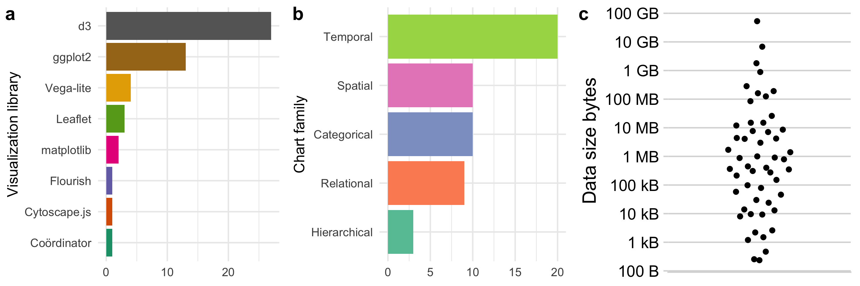
As you can see from the bar chart of visualization libraries, I grew to love d3 and it quickly became my “go to” tool. It allows you to do almost anything, but requires a lot of work. I would often use ggplot2 to do a quick analysis, then turn to d3 to present the data in exactly the way I wanted to - particularly if it involved some kind of interaction or animation. ggplot2 is great, it’s much easier to generate an off-the-shelf chart - so I used this a lot too, and spent some time trying to improve on the default presentation (shout out to cowplot here, also from Claus Wilke, and used in the charts above). Vega-lite is in third place - I didn’t reach for it as much, but I can see it becoming a useful output from other tools (like ggvis and Altair).
The second bar chart shows the distribution of the type of visualization, divided into families (irrespective of the tool used to produce it). The families are from Andy Kirk’s handy Chartmaker Directory (the same ones appear in his book too), and are intended to capture the primary role of each chart.
Most of the visualizations have a temporal dimension (how does x change over time?). I became aware of my bias here, and consciously tried to come up with visualizations that did not have a time dimension (and in fact most of my favourites were not time plots, see below). I did produce a large variety of chart types though (not shown on the chart, but the visualization type is listed on the page for each visualization) - something else that I consciously tried to do.
The third chart shows the distribution of the size of each dataset. The dataset sizes ranged over 9 orders of magnitude - from a few hundred bytes to tens of gigabytes. I didn’t pay much attention to this - my prime interest was finding interesting ways of presenting interesting data. There was no correlation in my mind between dataset size and how interesting it was - I was certainly not trying to visualize large datasets (I was quite happy to do so, but never needed more processing power than a single machine to do so).
The biggest challenge was finding interesting datasets, then turning them into a form suitable for visualization. This “data cleaning” step is notorious amongst data scientists as being slow and hard to automate. I didn’t have any special tricks here: I generally just wrote a Python script to do any pre-processing I needed. I’ve published all of the code on GitHub.
My five favourite visualizations
In the order I made them:
This was the first dense, interactive d3 visualization I did, and was when I really “got” d3. I like the fact you can spend time exploring the dataset with this visualization.

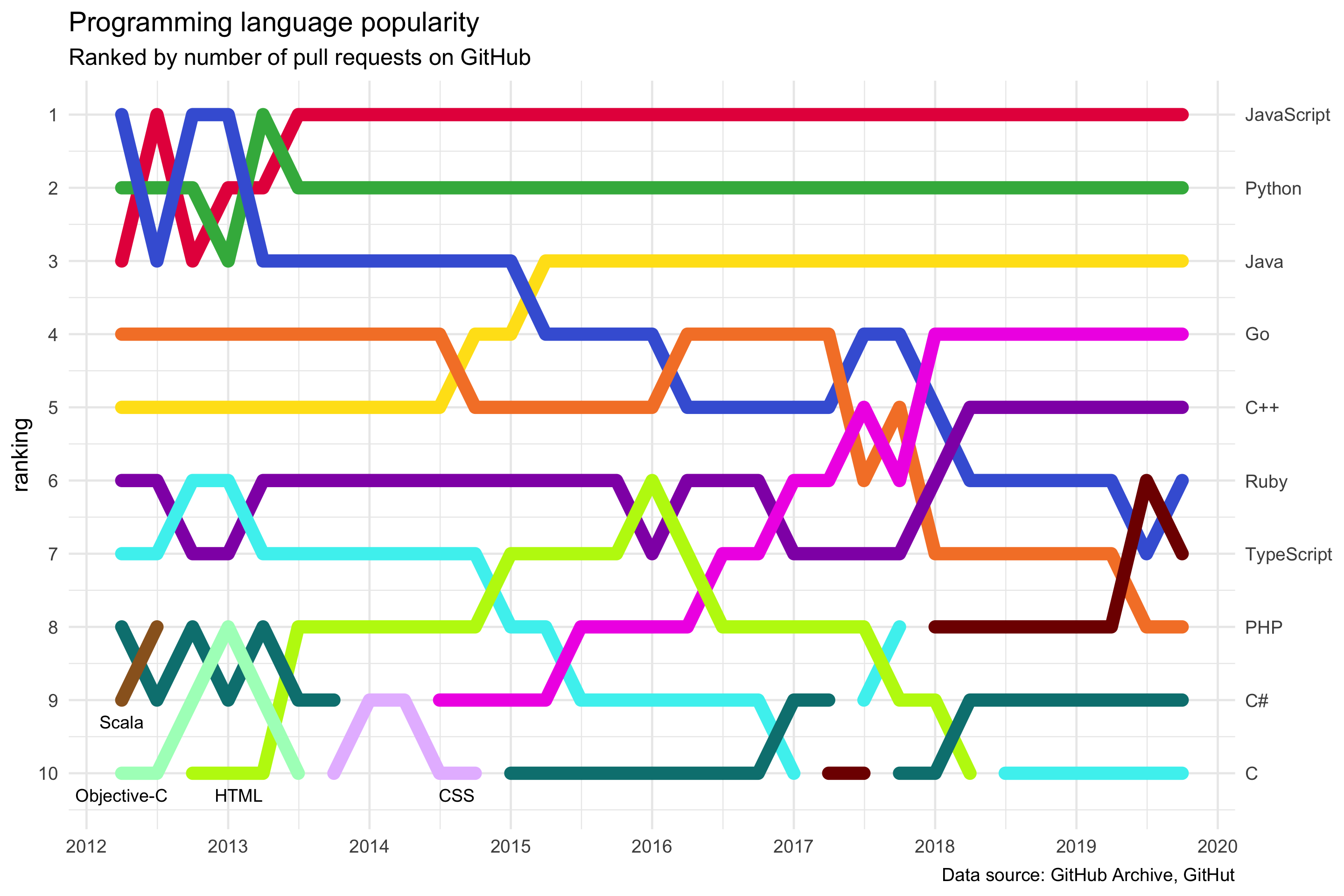
Programming language popularity (week 12)
This is bright and fun - and doesn’t look like it was done in ggplot2.
Not the first animation I did (that was Lots of Lotties in week 14), but possibly the most mesmerising.

A piano keyboard is basically a bar chart.

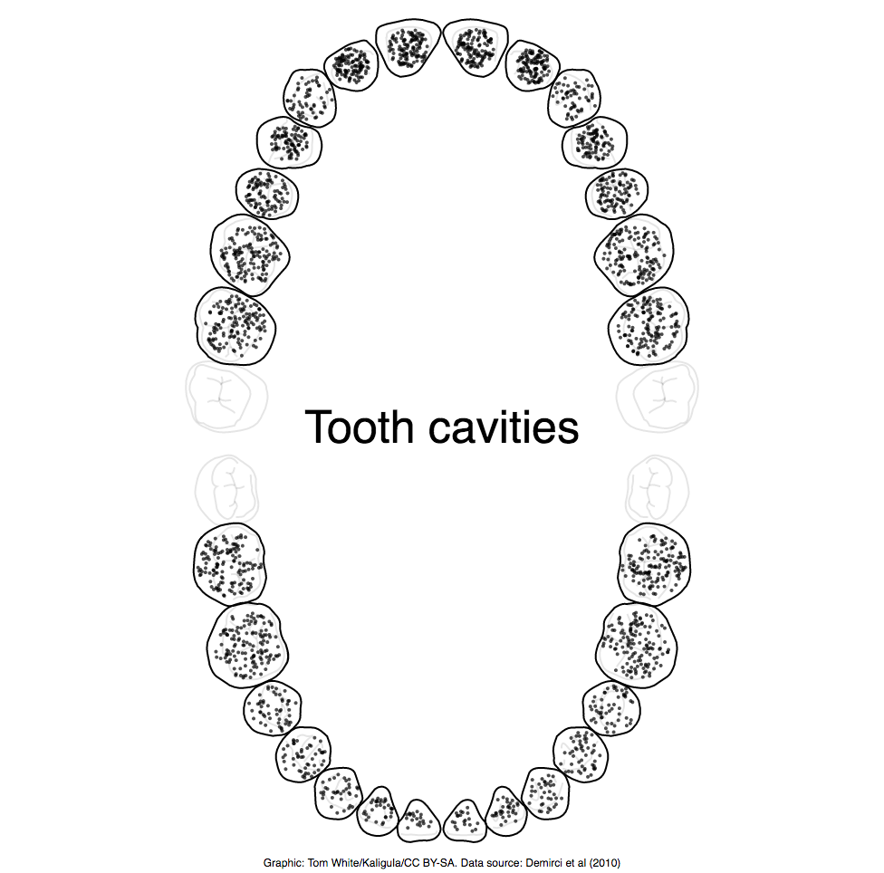
I like the simplicity of this data visualization - it conveys the data very intuitively (and my dentist approves).
Visualization type: bar charts and beeswarm plot
Data source: Datavision, CSV, 3.5 KB.